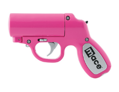
girlfend

No one should ever have to police what she wears to feel safe.
GirlFend is a solution that combines style and armor. Secretly embedded with weaponry, every GirlFend piece is a statement on society’s disregard of the female experience in public spaces.
GirlFend is a solution that combines style and armor. Secretly embedded with weaponry, every GirlFend piece is a statement on society’s disregard of the female experience in public spaces.

Brand Development
GirlFend is confident and inconspicous – the embodiment of vocal empowerment.

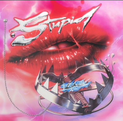


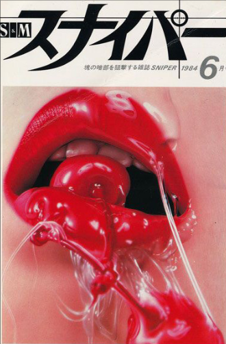


Mood Board
This moodboard examines the range of femininity through history/time and how its shock to patriarchical ideals has translated to lasting iconism.
Common Themes:
/Co-opting the Body as a Weapon
/Sticky Hot Pink
/Challenging Authority
Common Themes:
/Co-opting the Body as a Weapon
/Sticky Hot Pink
/Challenging Authority

Logotype
Bringing intention towards naming and visual identity – GirlFend balances danger with subtle movements.
Various icon explorations.

The Feminine Icon
The female sign is connected to Venus, the Roman goddess of love, whose Greek equivalent is Aphrodite, considered to be the most feminine. The female symbol depicts a hand mirror. It is a tool used for view, one of pride and appearance. By embedding these associations together, the icon defines a woman by her image and what she has to give to others.
The Heroine & The Sword
The Heroine is a woman wholly admired for her courage, achievements, and noble qualities. Her talent and prowess are not to be overlooked or soften for the male gaze (nearly no one). Haloed, The Heroine is the secret wielder of the sword, the bearer to a just pursuit of honor and virtue.
Logomark
Paying homage toward female knighthood by branding a hidden sword, GirlFend is a hybridized symbol of protection, authority, and bravery.

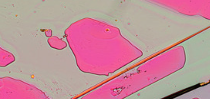
Color
Highlighting the transformative aspect of being empowered and being.